
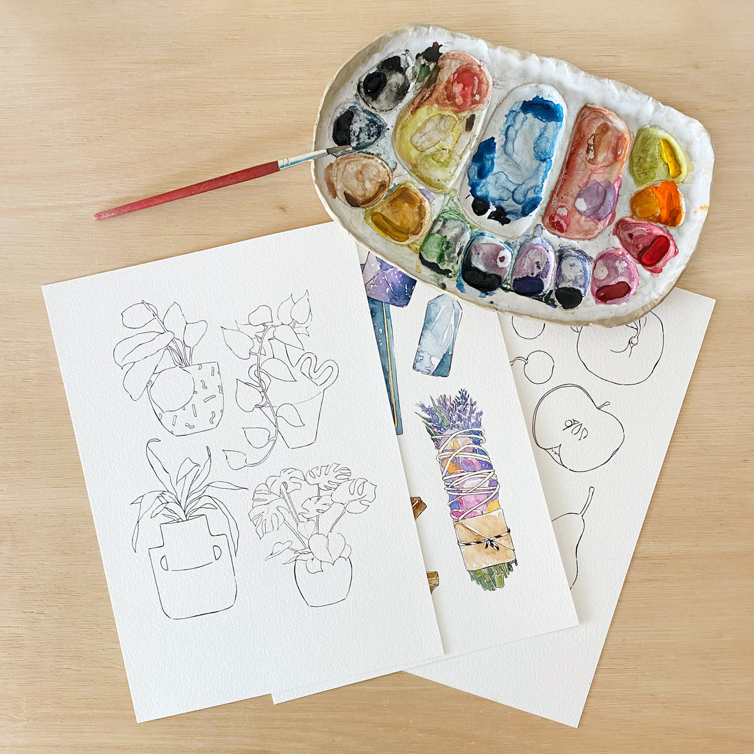
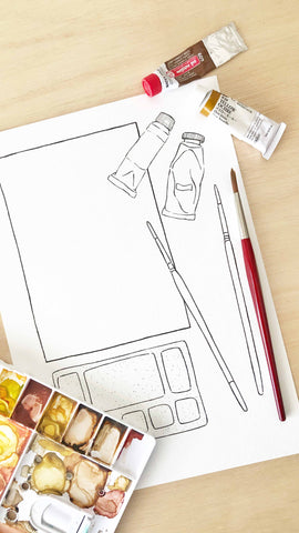
Are you looking for a fun Art Project? If you are considering to start to paint with watercolors, I think that consistency is key. Practicing every day makes a compound effect. Little, everyday decisions will take you a step closer to where you want to be.
I made this Coloring Book thinking of a challenge you can make to yourself: Paint a page everyday. That’s what I did during quarantine, and you can watch all the process videos of the 18 pages in Good Objects Instagram reels.
Once you download the At Home Coloring book, you can print it on watercolor paper. If you don’t know which paper to use I suggest you read the How to choose the right watercolor paper blog post.
PAGE 1 - FRUITS
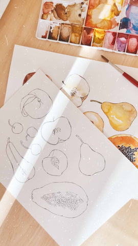
First page: Fruits. It's much easier to achieve a realistic result when looking to a reference image while painting. If you don't want to search for your reference images, I did the work for you in this video.
Some tips for watercolor painting fruits:
- Use brown to make shades instead of black. Black is considered an unnatural color and it is difficult to predict how is going to change your hue. Brown, or a complementary color of the color you are painting ( for example try painting shades with green if you are painting a red apple) will make more realistic shades when painting an object from the nature.
- Cherries are really shinny. To make this light, leave a white space unpainted.
PAGE 2 - MONDAY
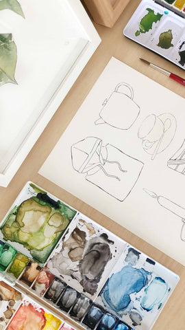
Hope you started the coloring book on a Sunday! :) On day two we are painting some classics from a Monday. This is a really simple page, but here you should consider:
- When painting clothes you can see in this video that I leave some white spaces. I usually do this to create the effect of volume as clothes naturally fold and have wrinkles. The result is a more realistic fabric texture.
- The teapot, candle, and cup have a cylinder shape. You should define where is the light coming from and make the shades accordingly. If you can't imagine this, look for a reference image. If you still find difficult to understand lights and shades on an object try turning the image to black and white.
PAGE 3 - HOME OFFICE

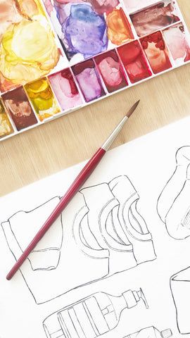
Page 3 is about Home Office. Here are some white spaces to create whatever you like on the screen and on the papers in the board. I have to say that this page has some details. To paint small details grab the brush close to the bristles and perpendicular to the paper applying light pressure. Control the amount of water you are using in small spaces.
PAGE 4 - HOME DECOR
I like how color combinations can make this page turn into completely different styles. Earth tones? Patterns? Vibrant colors? When painting the cushions, wait until it's dry for each cushion so they don't mix. Check in this video how I painted one cushion, then switched to other objects while waiting to dry for each of them.
PAGE 5 - BREAKFAST
When painting a fabric with a pattern, paint the shadows first. Then take the stripes as a meditation! It will take some time, yes. If you don't have the patience to paint it, just watch the high speed time lapse here.
PAGE 6 - JUICE
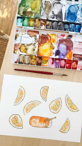
Painting orange juice or lemonade? Your choice! I suggest that you paint the pulp bit by bit like I did in this video, leaving white spaces.
Make the straw reusable - metal or bamboo?
PAGE 7 - NAP TIME
Batch painting. First: everything brown. Second: everything yellow. Third: everything green. Then it's just the details. You can take a nap after painting this one, you deserve it.
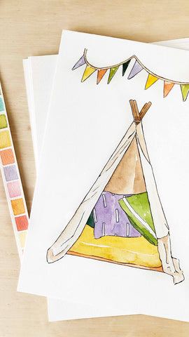
PAGE 8 - WISH YOU WERE HERE
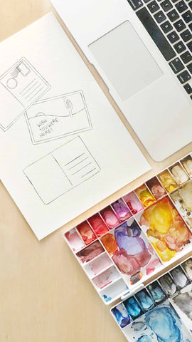
I really miss traveling and you? You can see in this video how I made the complete process of this postcards including the tracing and drawing.
If you want to know more about how I trace, you can check the blog post: How to trace without a lightbox.
And if you want to know more about the outline drawing, including the pen I use, check this blog post: Outline drawing before watercolor painting.
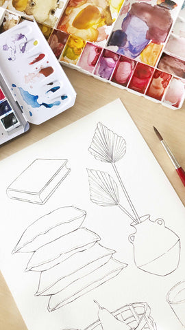
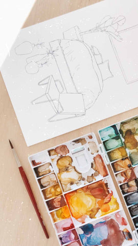
PAGE 9 - PLANTS
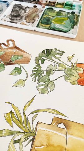
Some tips to paint plants with watercolors:
- Make some different hues of greens in your palette. Green + brown, green + yellow, green + blue. Having the already mixed colors on different shades helps to make more interesting combinations.
- Green is a color I never use straight from the tube or pan. I like adding a bit of an extra color to make it look more natural.
- Newer leaves are usually lighter. Use a lighter green on the small & new leaves.
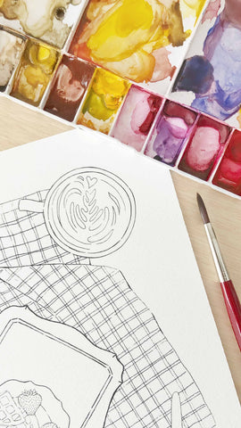
PAGE 10 - COFFEE
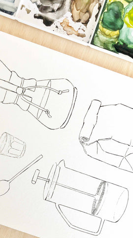
I painted all this Coffee page with only 3 colors: Burnt umber, yellow ochre, and sepia- earthy tones at it's finest!
- For the kitchen towel I used burnt umber and lots of water. Then I waited till it was dry and painted the stripes with yellow ochre.
- For the spoon I made the gold color with yellow ochre and a bit of sepia.
- The coffee in the coffee cup is just sepia. Then I painted the glass part with a bit of sepia and lots of water. I would usually paint glass with a bit of indigo mixed with sepia, but in this case I wanted to keep the earthy tones as I mentioned before.
- I used burnt umber for the filter in the chemex and waited to dry. The coffee is just sepia, and the wood part is burnt umber with a bit of yellow ochre. For the glass part, again - sepia with lots of water.
- The paper bag is just burnt umber.
- For the french press I used sepia for the press part and yellow ochre in all the rest.
If you want to know exactly how I did it and how I mixed the colors for each object check the video.
PAGE 11 - RELAX
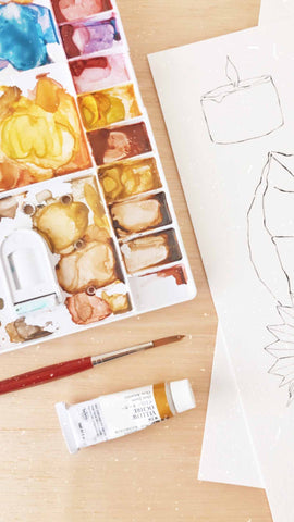
Relax time with a drink and a candle, count me in! For this page you already have references for almost all the objects, we already painted candles, plants, drinks, and cushions. For the glasses mix indigo, a bit of sepia and lots of water. Leave some white spaces for the glass reflection.
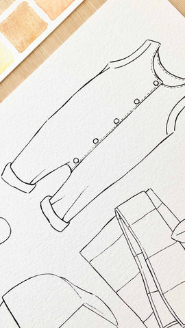
PAGE 12 - HOME OUTFIT
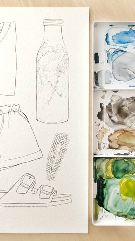
When working on a composition with several elements, sometimes it's a good idea to have a color palette done before to check the colors you will be using. Besides this, there are some colors that repeat in some parts of the illustration and make the overall look of the illustration feel more harmonious. you can see here that I use yellow ochre for the hair clip and in the lemon of the lemonade, and this two elements are in opposite corners of the page. I also use green in the sandals and in the leaves inside the drink. This is not mandatory, and should not always be like this, but I think that sometimes creates a good aesthetic.
PAGE 13 - ART PROJECT
Use your imagination on this one and create whatever you like! I think that if you know me you won't be surprised of what I made: Check it here.
PAGE 14 - KIDS
I like making illustrations for kids that are gender neutral, but there are so many color combinations you can do here.
PAGE 15 - RITUALS
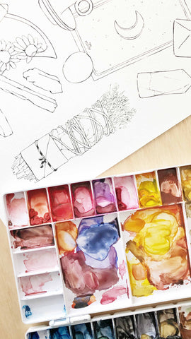
Okay yes, this one is the most difficult page to paint in the coloring book. It has so many details but is also my favorite!
PAGE 16 - MARIE K
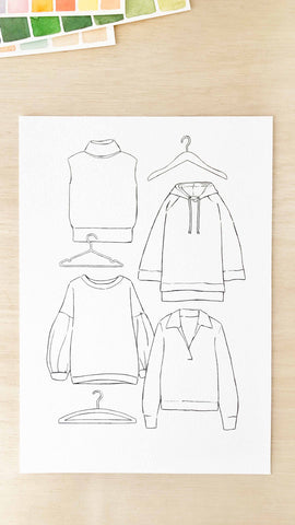
Classic quarantine activity: Organize the clothes following Marie Kondo style! I think that she wouldn't approve having these sweaters hanging on hangers.
PAGE 17 - BABY
For the Baby page I also made a gender neutral combination: Greens and browns. It's kind of a tropical baby situation. Wait for the blanket to dry before painting the other objects that are over it.
PAGE 18 - SELF-CARE
The last one! I really liked this page too! The vintage looking beauty creams are really fun to paint. I use a lot of water so it creates the effect of transparency. I'm also a big fan of socks and comfy wear in matchy colors.

Are you ready to paint it now? Check the At Home Coloring Book here!
I would totally love to see your results, I gave you some guidance here, but it can be painted with so many different styles or materials that I can't even imagine. Share it with someone who loves to paint, comment, or leave me a message on instagram!
Not ready yet? Pin it for later:
